Niagara Icon Buttons
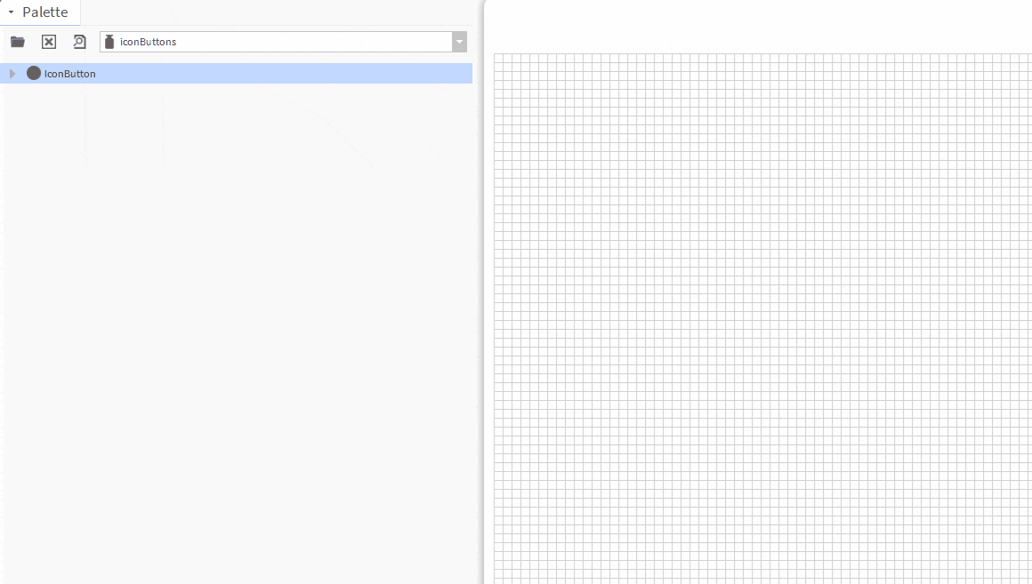
- Drag n' Drop
- Links to Ord
- Font Awesome Icons
- Clean pristine animation
- Completely Configurable
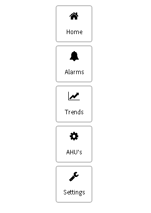
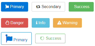
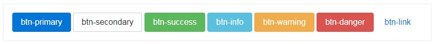
Use font awesome custom icon button styles for actions in forms, dialogs, and more. Includes support for a handful of contextual variations, sizes, states, and more. Adds font awesome icon button. Before you start, copy the .jar file to your modules directory. Restart the station and Workbench.
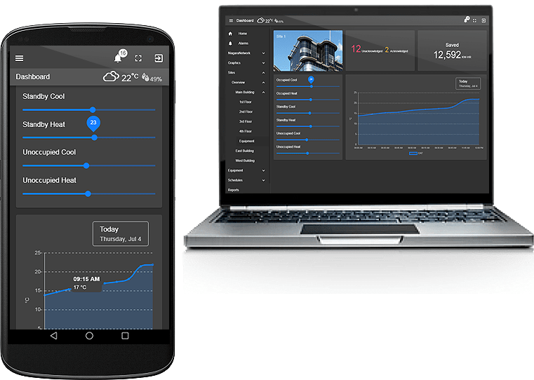
Are you looking for a cost effective way to manage and visualize data for all your customers? Why not have a look at View Builder?
Before you start. Download the modules from our portal (see your order confirmation, which also explains licensing). Copy the modules file to your modules directory. Restart BOTH station and Workbench.
1. Copy the iconButtons-ux.jar file to your modules directory.
2. Open the module from your palette file.
3. Drag and drop the widget from the palette onto your px view.
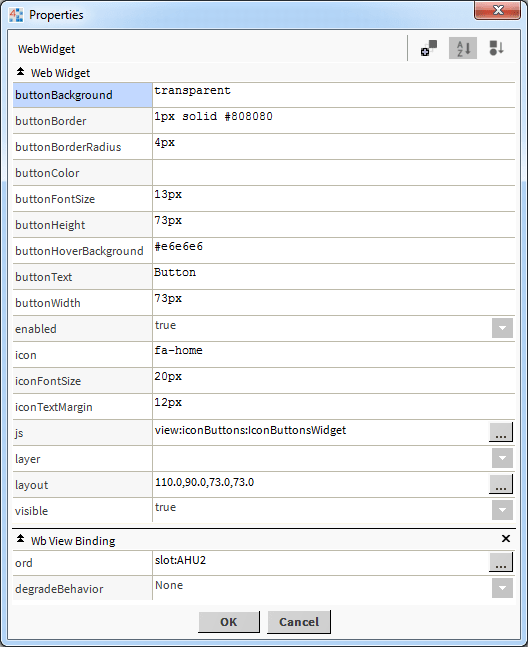
The buttons have a number of configurable properties that can be used to modify look, feel, and functionality. Change the properties as required.
Main Ord:
The Niagara object the button points to.
Set this to an absolute ord, e.g.
station:|slot:/Drivers/NiagaraNetwork/AHU5
OR
relativized ORD e.g.
slot:AHU5
Colors:
When changing colors, all icon buttons on screen are affected and should be set to the same color scheme.
The Icons:
The icon should be in the format fa-name, eg. fa-lock or fa-home. For a list of possible values click here
Button Text:
The button text to show on the button. You can also enter html character codes. E.g. new line return:
My<br />Button
Build Your Own dashboards and win Projects by showing data that increase value and reduces expenditure.