N4 Linear Gauge
- Drag n' Drop
- Binds to numeric point or numeric writable
- Configurable Color Segments
- Vertical or Horizontal Orientation
- Shows Tooltip Value
- Updates in Real-Time
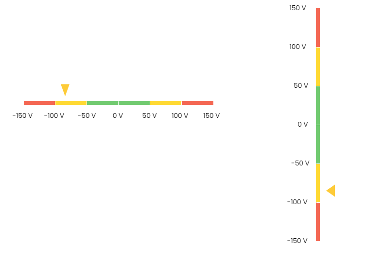
The linear gauge shows a numeric value on a spectrum line with coloured segments. Bind the widget to a numeric point/writable. The min/max range are taken from the facets. The segment colours are configurable to different start/end points. Tick marks and labels can also be configured. The triangular needle changes colour based on the value within the spectrum and also includes a tool tip when hovered over with the mouse. You can also set the orientation to vertical by setting the horizontal property to false. The value and needle updates in real-time. The gauge has a number of configurable properties that can be used to modify look, feel, and functionality.
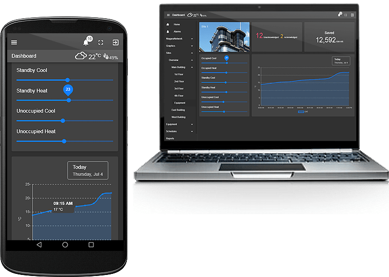
Are you looking for a cost effective way to manage and visualize data for all your customers? Why not have a look at View Builder?
Before you start. Download the modules from our portal (see your order confirmation, which also explains licensing). Copy the modules file to your modules directory. Restart BOTH station and Workbench.
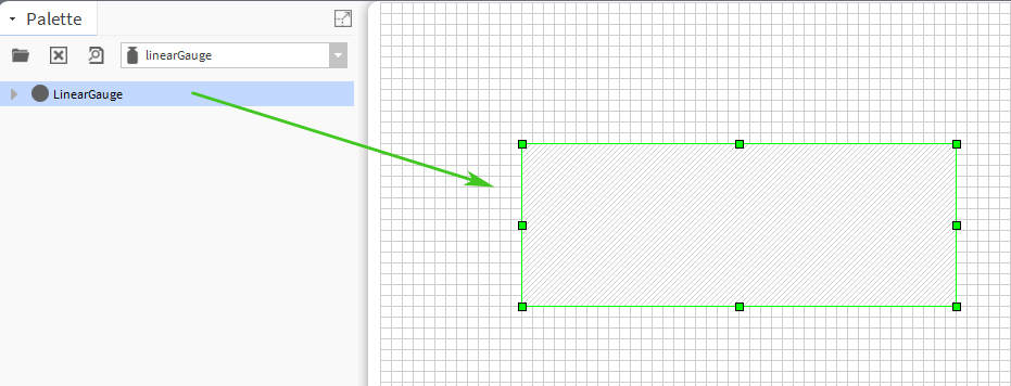
1. Copy the linearGauge-ux.jar file to your modules directory.
2. Open the module from your palette file.
3. Drag and drop the widget from the palette onto your px view.
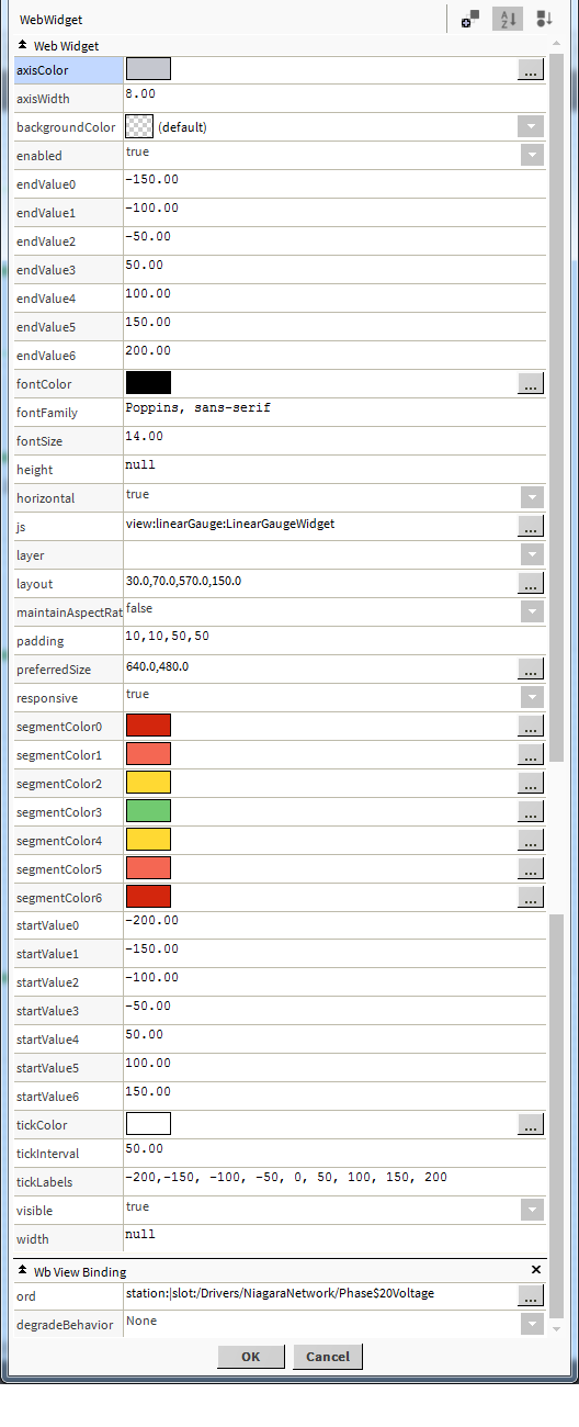
The gauge has a number of configurable properties that can be used to modify look, feel, and functionality. Change the properties as required.
The widget has a number of configurable properties that can be used to modify look, feel, and functionality. Change the properties as required.
Changing Widget Properties - most properties are self-explanatory but some require some explaining.
Ord: Main widget ord binding. Absolute or relative ord. Its important the facets are setup correctly on your point. The min/max range of the gauge is taken from the segments.
Segments: You can have up to 7 segments. You can also duplicate a colour if you want it to span over 2 or more segments.
Tick Label: Example: '-150,-100,-50,0,50,100,150', To skip a tick clear the value. For example -150, , -50, 0, 50, 100, 150 would like no tick label after -150.
Tick Interval: How ofter a tick should appear. If you have a min/max range of 300, a value of 50 would place 5 ticks on the gauge. Default if 50.
Background Property.
The canvas background (the area behind the widget) does not go transparent in Workbench View unless you toggle the 'Toggle Browser Preview' button. All browsers are ok.
Height/Width:
Set these values to specify an exact height/width for the gauge canvas.
Maintain Aspect Ratio/Responsive:
Set these value to true or false to scale properly on screen.
Vertical/Horizontal:
For vertical placement, set horizontal widget setting to false. Maintain aspect ratio to false, and responsive to true. Padding should be 10,10,10,10. Also set the height value. On the actual point make sure the facets are setup correctly. e.g. min/max.
Build Your Own dashboards and win Projects by showing data that increase value and reduces expenditure.