Niagara Toggle Switch Button
- Toggles Boolean Writable
- Bootstrap Styling
- Drag n' Drop
- Automatically Updates Current State
- Works in Workbench and Modern Browser
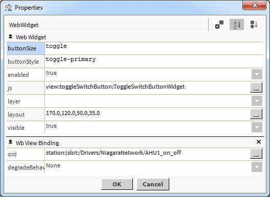
The toggle switch button has a few configurable properties that can be used to modify look, feel, and functionality. The widget binds to a Boolean Writable. You can control the value and get a real time update of its state. So if the boolean is true, the toggle will be off, and vice versa. Before you start, copy the toggleSwitchButton-ux.jar module file to your modules directory. Restart station and Workbench.
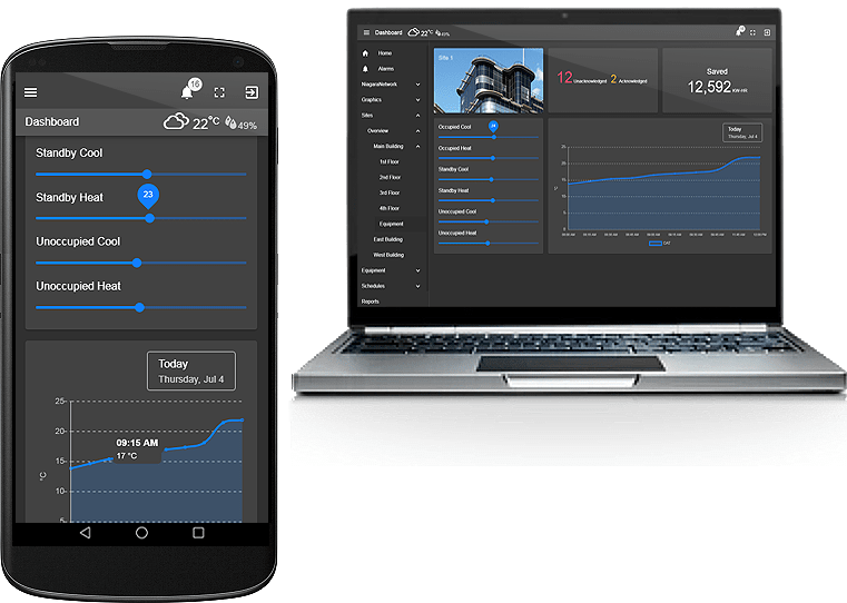
Are you looking for a cost effective way to manage and visualize data for all your customers? Why not have a look at View Builder?
Before you start. Download the modules from our portal (see your order confirmation, which also explains licensing). Copy the modules file to your modules directory. Restart BOTH station and Workbench.
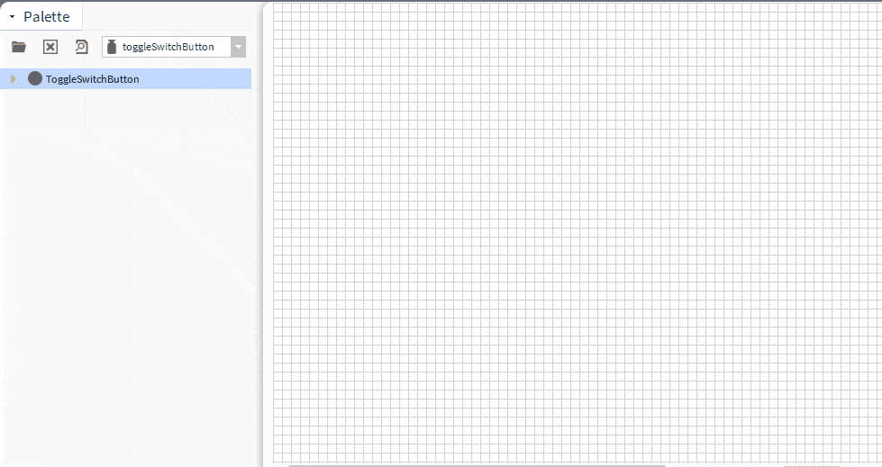
1. Copy the toggleSwitchButton-ux.jar file to your modules directory.
2. Open the module from your palette file.
3. Drag and drop the widget from the palette onto your px view.
The toggle button has one main property, the ord. It should point to a boolean writable.
This can be an absolute ord, e.g.
station:|slot:/Drivers/NiagaraNetwork/AHU5
OR
relativized ORD e.g.
slot:AHU5
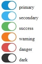
Button Style:
The button has the following styles:
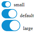
Button Size:
The button has the following sizes. To set the size, set the button size property either toggle, toggle-sm, or toggle-lg
Build Your Own dashboards and win Projects by showing data that increase value and reduces expenditure.